

In this article, Jackie Raulerson discusses how to share your practice and treatment successes with an effective presentation
A powerful presentation creates curiosity, provokes thought, and puts the focus on you and your valuable information. Like telling any effective story, there are distinct steps to crafting the perfect deck of slides to support your lecture. During my career, I have enjoyed assisting many dentists and other dental professionals in creating or enhancing visual materials for their slide presentations. This article shares some tips and techniques that I’ve learned to produce a meaningful and memorable presentation.
Depending upon the type of presentation — a clinical case showing the use of specific products or covering a practice-management technique — different approaches are necessary. The subject matter will determine the formality of the presentation and, in some cases, dictate its visual appearance. Presentations that offer continuing education (CE) credits come with their own set of guidelines and usually are peer-reviewed. Many CE providers specify that the presentation must be non-commercial; therefore, you are required to eliminate any identifying patient information and not show bias to a particular product. They may limit the use of brand names, instead preferring to use the generic type of technology or equipment these products represent. You also may need to include references for any clinical claim you make for any product or fact.
The key to building an effective presentation
Your audience wants to focus on you and your information. Any distractions should be eliminated. Whether using PowerPoint®, Keynote™, or another program, the same general “rules” apply. It all boils down to this: Keep it simple in both design and content.
Slide design
Slide size or resolution
Each venue will have a specific size of TV, monitor, or screen on which your presentation will be displayed. Before building your presentation, verify the specs with the event coordinator. You want your slide to grab the full screen (Figure 1B). If your presentation was built with a different resolution, you can make changes, but you will want to do this ahead of time.
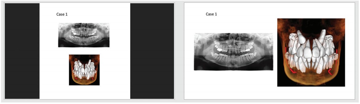
Figures 1A-1B: On the left, a less wide resolution will present with black bars to each side. A correct size or resolution will
cover the screen for full impact. (All clinical images herein courtesy of Juan-Carlos Quintero, DMD, MS)
Before you present to your audience, run onsite tests to ensure that there is no slide stretching or squeezing and thus visual anatomical distortion (Figure 2).
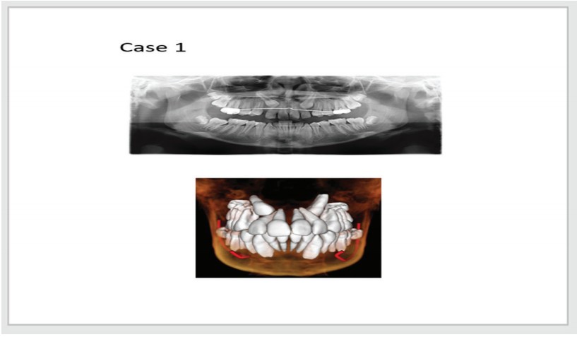
Figure 2: Due to improper settings, the slides are stretched to fill the monitor’s screen
Your master slide
Some associations and companies (if you are speaking on their behalf) have a master slide that you are obligated to use. However, if there are no restrictions, you should create your own master slide that speaks to who you are but not too “loudly.”
Your professional information
If you want to use your logo, name, and contact information on each slide, the size and combination of these may be too distracting to appear slide after slide. In this case, consider showing the full information in a larger size at the beginning, for instance, on your “bio slide,” and then switch over to a diminutive version on the remaining slides. As seen in Figure 3B, the logo and practice name show at the bottom the slide, smaller, and slightly watermarked or faded.
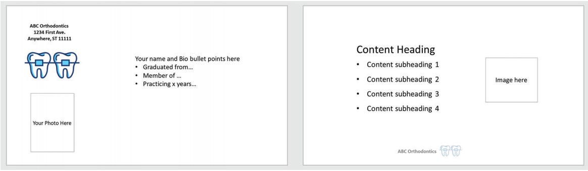
Figures 3A-3B: The left slide shows the initial and full use of your practice information, while the right slide shows name and logo only — much more appropriate for all remaining slides
Color and/or background
When considering slide color and background, keep in mind that “clean” does not equal “boring.” White, black, or neutrals will keep the audience focused on the information on the slide. It is best to be consistent with one color throughout the presentation. For example, Figure 4B slide shown in various background colors within the same presentation can force changes in font color and interfere with image backgrounds. These changes also require the eye and mind to adjust before concentrating on the content.
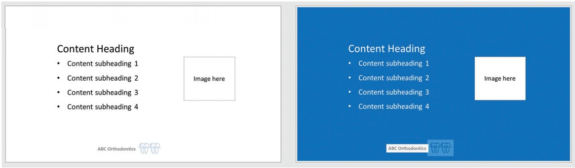
Figures 4A-4B: The slide on the left is a basic (but not boring) background. The slide to the right changes to a blue background and drives a font color change. However, the logo and image are on a white background, which can be distracting unless you take the time to edit
Slide transitions
Busy slide transitions are one of the greatest offenders of distraction. Spinning, checkerboarding, or swooping of slides can be jarring — consider a simple fade from one slide to another for a more professional presentation.
Presentation Content
Divide and conquer
Sometimes too much information can be overwhelming. Breaking up a subject is the easiest way to conquer a huge amount of information. At some point, you will need to decide what to include and what to delete. This will be driven by your objectives and, of course, the time limit.
Start with an outline
Creating an outline will help you make editing decisions. An outline will also help you generate a cohesive, organized flow and avoid tangents. Limit the number of cases to those that meet the main statements of your outline. For example, if one of your objectives is to show how the use of aligners has worked in your practice, pick the best few examples. There is no need to show 10 cases when your point can be made with three.
Slide Content
Text
We’ve all seen presentations where there are way too many words on the slide (Figure 5A), which forced the presenter to become a “slide reader.” While it may be appropriate for more extensive information to appear on your handouts, the amount of text on a slide should be minimal. Edit text to be clear and concise.
Typically, bulleted information is easiest to digest. Each bullet should be short and to the point. If you have more than a few bullets on a slide, consider splitting the information into several slides.
Select a font, font size, font color, and bulleting style that are simple and easy on the eyes. These should match throughout your presentation. Use color, bold, italics, or underline select words for emphasis —just not all of these at once!
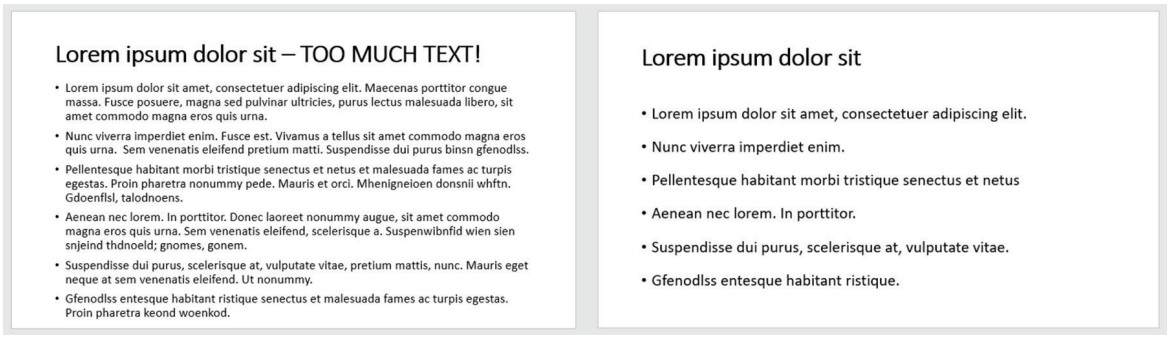
Figures 5A-5B: Follow the 7 x 7 rule for slide text — try to use no more than seven lines of text and no more than seven
words per line. Seen here, the right slide is obviously easier to understand than the left slide
2D clinical photos and X-rays
Your presentation will be displayed on a large screen. This makes image resolution critical for all clinical images. A pixelated or blurry image is not useful. Capture and save clinical photos in high resolution. You can always reduce resolution after capture; you cannot increase it very successfully. Crop out distracting or unimportant information in the photo or image. Additionally, there is no need to heavily notate an image with text if you will discuss the same information in your lecture (Figures 6A-6B).
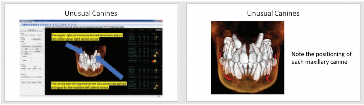
Figures 6A-6B: On the left is a slide with a pixelated image, too much text overlay, and unnecessary visual information; it is distracting. The slide on the right has a clear image with minimal text and is cropped to show the area of interest
Video clips
Use a video, especially in 3D technologies and imaging, to show anatomical structures. While you may be familiar with using your 3D program, others may not. I would urge you to plan ahead when recording specific procedures. It may be helpful to mix video with high-quality digital photographs that you take during the procedure.
Charts
Often there a clean, simple way to show considerable amounts of information, especially numeric stats. For example, if you have a great deal of data in written form, make it easy for your attendees to see at a glance by using a chart. Programs such a Microsoft® Excel create attractive charts from line items (Figure 7B).
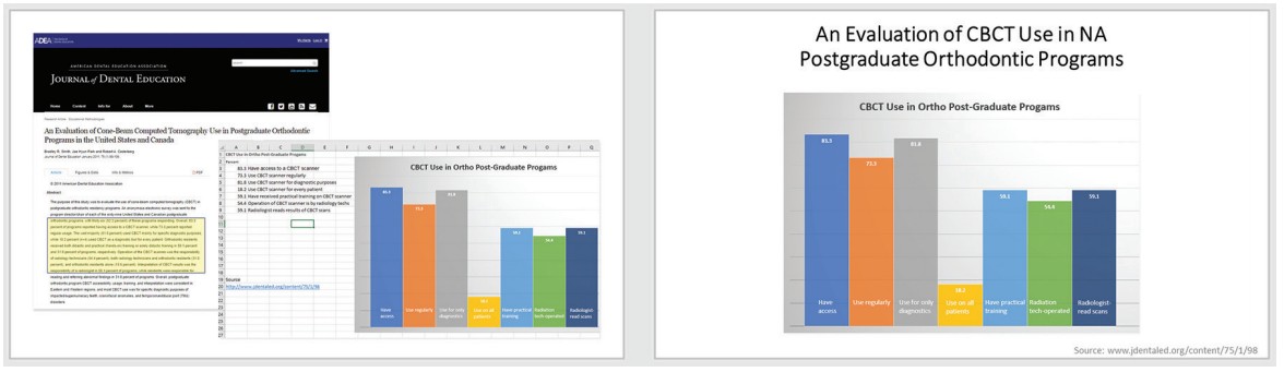
Figure 7: The desired statistical information in this article can be placed into a nicely readable chart
Graphics
Graphics and other photos can support your presentation and break up slide content to maintain interest. For example, if you want to speak about an increase in your production, an image can often convey this, as well as or better than text (Figure 8).

Figure 8: Simple graphic that lets you and your information take center stage
Give credit where it’s due
The Internet offers all kinds of information in text and image form. While these exist in a public domain, someone created it. If you use this information, give credit either on the slide or at the end of your presentation. For copyrighted material, such as articles or a clip from a web series or TV show, request permission to use.
Review, review, review
Finally, review your presentation for specifics: spelling, consistency in alignment, font, transitions, and length. While it takes more time, it is productive to concentrate on one of these at a time. For length, consider your time limit, and run through your presentation to ensure you can stay within the time frame. Be sure to leave 5-10 minutes at the end for a Q&A with attendees.
Where to go for help
In terms of selecting proper content and creating its flow, my article in the January/February 2020 issue of Orthodontic Practice US should offer some assistance. I’m a big believer in YouTube™ learning. There are many how-to videos on good practices for building presentations, adding supportive visual materials, and even on delivering your information to audiences.
By following a few simple slide-building rules, you can effectively share your clinical and professional experiences with your peers. But remember, you are the most important part of your presentation. I hope that this information will give you more confidence in sharing your clinical and professional experiences. You can do this! As in dentistry, it all starts with a plan.